

Creating sophisticated data visualizations may not be for everyone, but a startup called Observable is trying to make the process a bit less impenetrable.
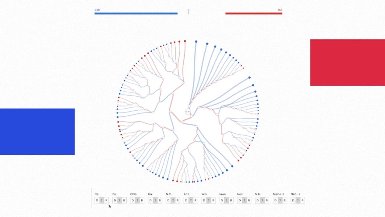
Observable provides a free website for creating complex graphs, charts, and other visual representations of data, such as face mask adoption in the United States or an Electoral College decision tree for the U.S. Presidential Election. While it requires some coding knowledge to use, it also lets anyone take an existing visualization and modify it for their own purposes, either by changing the visuals or plugging in their own data. That means people can start learning the ropes just by playing around with what’s already been made, and even the coding part scares you off, you can still visit Observable’s website to absorb its impressive graphics.

Observable first launched in early 2018, but just raised $10.5 million in a Series A round led by Sequoia Capital and Acrew Capital. Mike…
Read More…
Source : fastcompany.com
Source link
